Muddies
Bringing a business idea for a pottery subscription for kids to life
Brand Strategy / Visual Identity — Columbus, Georgia
Brand Evolution
Where Muddies Began…
Muddies was the invention of Mollie Jenkins. She’s been throwing clay since her senior year of high school and now sells her housewares under a brand with her own name. The idea for Muddies came to her after a decade of creating with clay. She wanted to give children that same opportunity to play and grow, stretching their minds and bodies as they play.
Where Muddies Is Headed…
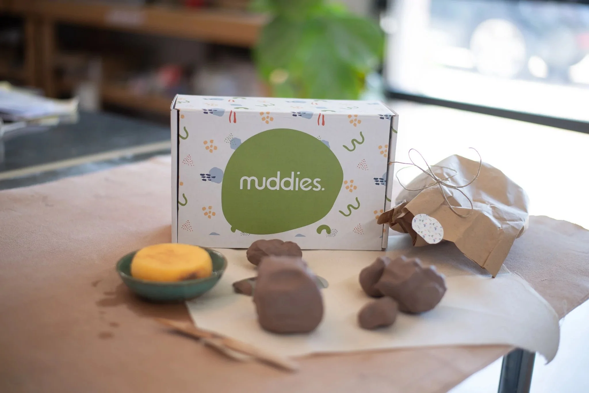
When Mollie came to us, Muddies was just an idea. There wasn’t a product yet, but there was a vision: bringing creativity and high-quality to a child’s craft table. Clay lets kids get messy and use their hands, all while creating magic in the comfort of their own home. We got to shape this vision into a visual identity and full-blown business.
Brand Keywords
Experience — Memorable — Playful — Enriching
Target Audience
Eliza, 44, is a part-time event coordinator, wife, and mom to two kiddos. She loves to read, garden, and find ways to incorporate her children into her everyday activities. Her home decor has a timeless, laid-back style. She’s always looking for ways to help her whole family learn new things together and create something with their hands. She likely found Muddies online from another friend and thought it looked like a fun weekend activity.
Visual Rationale
Mollie’s brand was designed to feel organic, balanced, and timeless—a direct reflection of her work. The serif font conveyed the high-quality, lasting nature of her pieces, and the curvy customizations of the font are a nod to the curves of pottery. The sans serif “Pottery” softens the logo, striking a comfortable balance. The marks and colors follow that lead, being both refined but comfortable.


