Williamson Design
Making sure a luxury interior designer stays creative
Brand + Squarespace Web Design Intensive — Atlanta, Georgia
Brand Evolution
Where Williamson Design Began…
Stephanie Williamson knew she was doing good work. She had owned her business for more than a decade and had a long list of happy clients. But she knew her online presence didn’t reflect her expertise, her experience, or her talent. She wanted people to get a sense of who she was and what she could do right when they landed on her site. She takes her clients on a journey, so they feel really accomplished at the end of a design project. She provides and experience that is excellent, luxurious, and full of ease. And she wanted her brand to reflect that.
Where Williamson Design is headed…
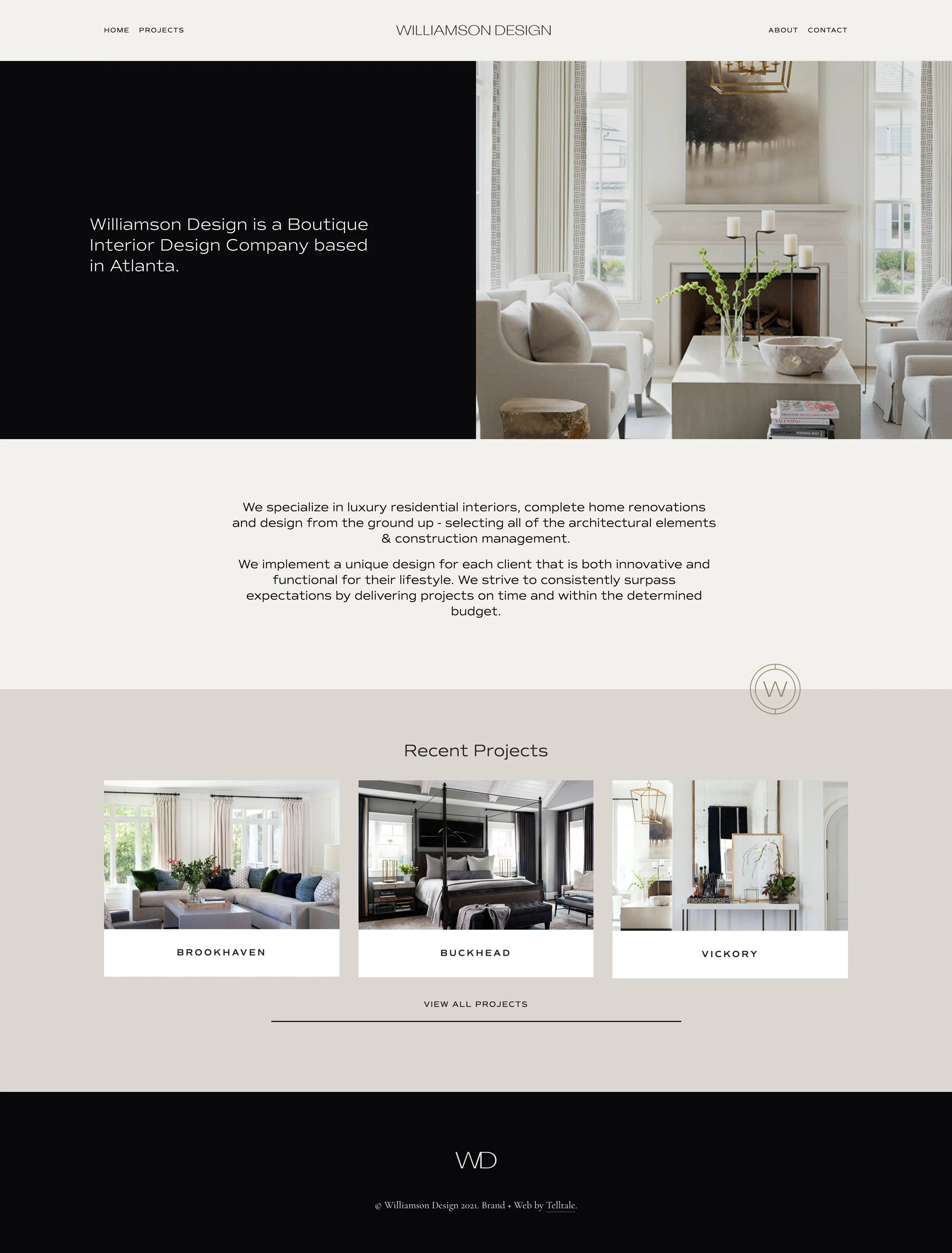
Something Stephanie prides herself on is truly getting to know her clients and their stories. She discovers who they are, how they live, and what kind of home they need to feel most comfortable and like themselves. She puts their personal touch on everything, bringing cohesion to every space. So her website needed to feel just that: high-end but comfortable, creative but cohesive. We wanted to design something for her that felt like home to her, but something that her clients could instantly relate to.
Brand Keywords
Friendly — Confident — Personable — Individualized — Expert
Target Audience
Melissa, 43 and Ben, 48 are a married couple who live in a wealthy suburb of Atlanta. They bought their home years ago and recently purchased a vacation home in 30A. With this purchase, they’ve realized their main house needs a big update. They know what they want, but have no idea how to get it and trust Stephanie to make their dream come true.
They have a clear vision, but also full trust in Stephanie’s process and love to collaborate with her. Melissa is more involved than Ben, but they seem to be on the same page about almost all of their decisions.
Visual Rationale
Modern should not always equal neutral. There is room for creativity and dare-we-say quirk within the genre of luxury. We wanted the Williamson logo to be both: for the people who wanted high-quality pieces and design, but with an unexpected splash of creativity. The thin, contrasted display sans serif we used for the text logo gives an upscale vibe, but plants Williamson firmly in the creative camp.


