The Fresh Bloom
Helping an idea for a European-inspired flower shop become a visual reality in a small lakeside town
Brand Strategy / Visual Identity / Web Design & Development / Brand Photography — Gainesville, Georgia
Brand Evolution
Where The Fresh Bloom Began…
This flower shop started as an idea between two sisters, Sara and Shelby. Their grandmother owned a flower shop, they both had business degrees, and they both were looking for a career chance. Enter: The Fresh Bloom. They wanted to bring a European-style shop to Georgia. They envisioned buckets of flowers outside their door, a flower bar where clients could style their own bouquets, and wedding parties coming in on the weekends..
Where The Fresh Bloom Is Headed…
We needed to take the idea in their minds and turn it into a reality. They wanted their flowers to be accessible and available, not stuffy or overpriced like a lot of floral shops. We drew from Shelby’s experience living in Europe to create a visual moodboard. Then we took the chic hues and typography from our research and developed a brand strategy, identity, website, and printed materials around it. The shop opened in 2019 and has met their goal of bringing flowers to everyone, all the time.
Brand Keywords
Welcoming — Knowledgeable — Sophisticated — Personable
Target Audience
Mattie, 38, lives in Gainesville after spending several years in New York City. She used to work in PR, but moved back to Georgia to slow down her life a little more and be closer to family. Now, she works as a communications professional, mostly doing remote contract work. She has created a robust community in her town, is extremely social, and is passionate about shopping local. She spends most weeknights on The Square, shopping at a small grocery store, attending a community event, or having happy hour with friends at one of the local restaurants.
Visual Rationale
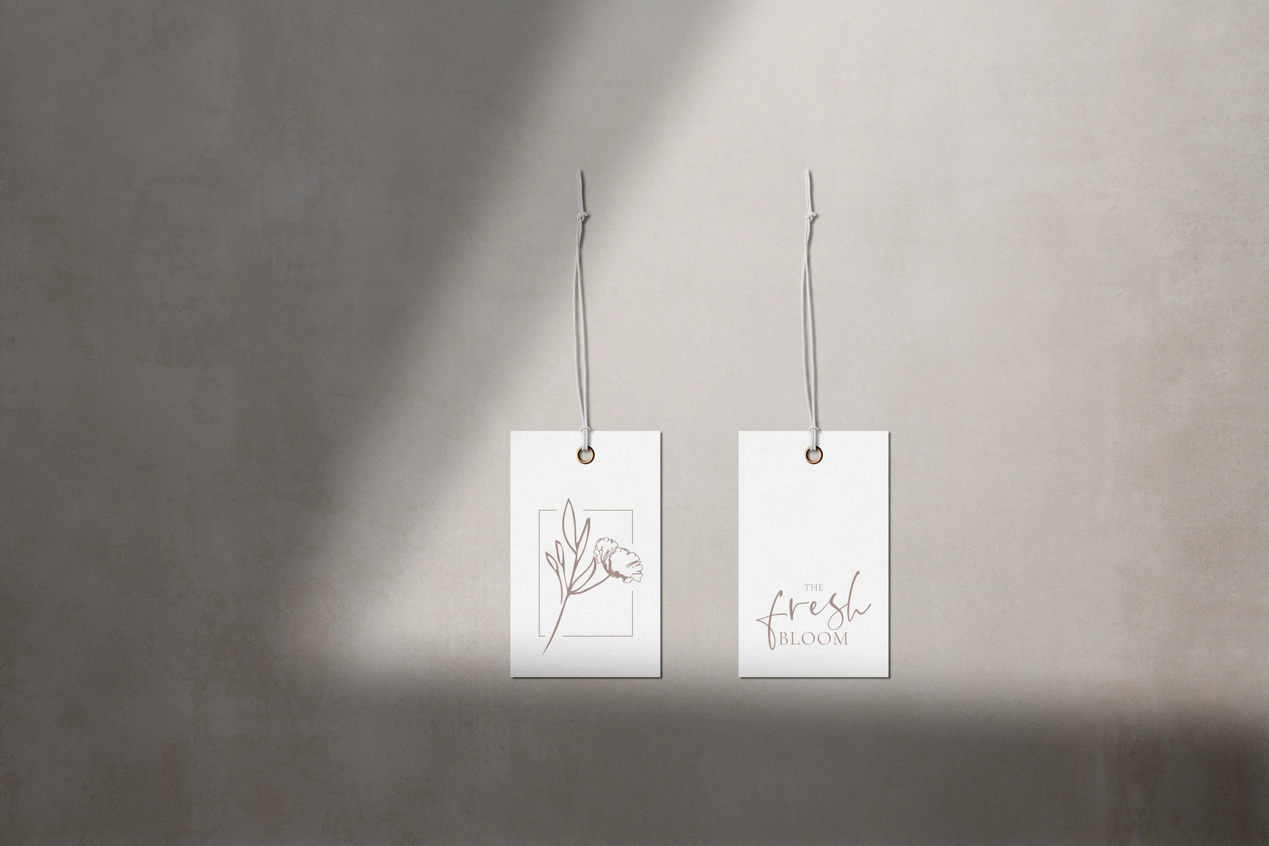
If you don’t know a lot about flowers, it can feel intimidating to walk into a flower store. The Fresh Bloom wanted none of that. They wanted it to feel warm, approachable, and friendly, all while keeping a sophisticated vibe. We chose to pair serif and sans serif fonts that matched the balance they were trying to achieve. The color story was blush and camel tones to communicate a calming and inviting atmosphere, alongside a deep evergreen to nod to the actual product.
Brand Values
Approachable — Stylish — Inviting

In Sara’s Words
“Our website design and branding was probably one of the most intimidating parts of starting up our company, but Lydia made it one of the easiest. In the two weeks we have been open for business, we have booked five weddings, and four of those have been inquiries through our website! I could not be happier with my branding, website design, and the help/ training I received from Lydia after web completion!”
If you’ve made it this deep into my site, you probably already know that collaboration is our favorite. This project was a team effort with the help of Amber Ladd on website development.


