Momento Goods
Re-aligning the branding for a fair-trade home goods shop
BRAND STRATEGY / BRAND DESIGN / Squarespace Web design intensive — Richmond, Virginia
Brand Evolution
Where Momento Goods Began…
We had the opportunity to work with Momento Goods when they first opened their doors and then again in 2021 to refresh their brand. Their mission remains the same: they thoughtfully curate fair-trade home and lifestyle goods that support women from around the world through sustainable economic opportunities and practical resources. They seek to build relationships among women around the world, working together to support opportunities, organizations and resources that nurture the overall well-being of women everywhere.
Where Momento Goods Is Headed…
When we first worked with Momento Goods, they were focused more on pieces for the whole home. When they came back to us in 2021 for a refresh, they decided to pivot more into clothing from around the world. We needed to re-strategize and update their look to balance and highlight the textiles that would now be displayed on their website. Their entire mission is focused on empowering women though, she we also wanted to keep the brand feminine and female-focused.
Brand Keywords
Transparent — Approachable — Confident — Down-to-earth
Target Audience
Bella, 31, lives a very balanced life. She loves to travel and does as much as possible. But she’s created an incredibly serene and peaceful home for herself and truly enjoys spending time alone to relax there. She also loves to host: small dinner parties, girlfriends over for movie nights, and even long-term guests who stay in her perfectly curated guest room. One of her core values is supporting other women and she makes a conscious effort to shop from women-owned brands.
Visual Rationale
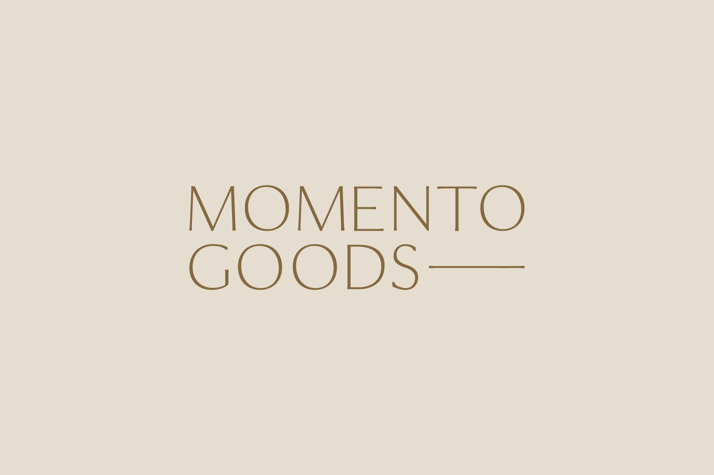
Though the clothing Momento Goods sells is simple, it’s impactful as well. We wanted the brand identity to carry that same weight. Rather than just a text logo like their competition, we created an incredibly unique and meaningful marks, one that stirs emotion alongside the text. Minimal, modern, and welcome were all words at the forefront of our visual direction. The words in the logo aren’t the same length, so we highlighted that difference, but married them back together with the line in the logo. Simple, but impactful.
In Lauren’s Words
“The Telltale team really understood my target audience and I think the brand mark aligns with the values and aesthetic of the brand— natural, sustainable, raw materials, earthy, minimal but warm. It communicates the message on a deeper level, more than I could’ve articulated myself into words. If you’re looking for someone to be in your corner 100% before, during, and even after your project, Lydia is your girl. She and her team go above and beyond to make sure you are supported throughout the process and they effectively communicate every step of the way. Lydia was able to translate my vision into into reality and create something that was not only beautiful, but also backed by intentional strategy.”


